Hillsboro Aviation
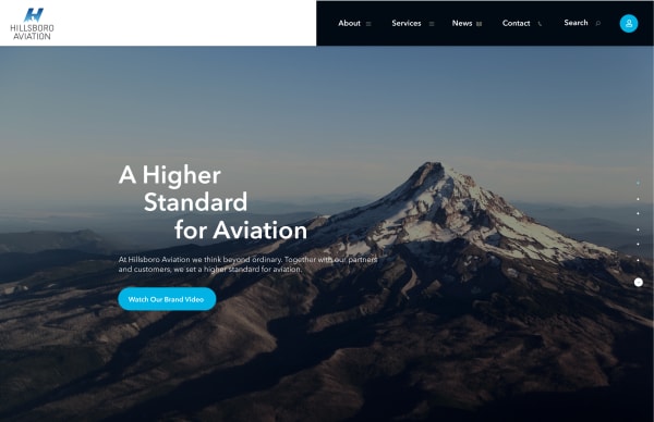
A diverse and robust site design that strategically blends high-level function with a content-rich, multifaceted UI.

Agency
- Murmur Creative
Role
- Visual Designer
- Experience Designer
Photography
- Client Provided
- Tim Acock
Completed
- July 2018
A small airport situated in Hillsboro Oregon needed a new multi-faceted website that worked well for all the expansive divisions of the company. A growing organization that includes safety and rescue, tours and charters, aircraft sales, maintenance and parts added to the complexity and disorganization that created a struggle to find the info a user needed. It was clear there was a need for a strategic overhaul to the interface and experience.
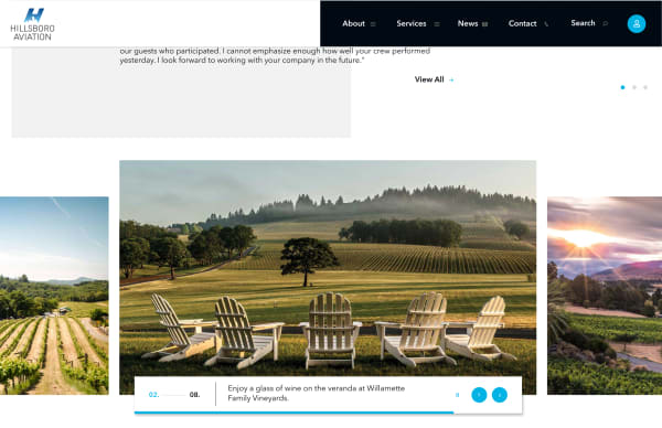
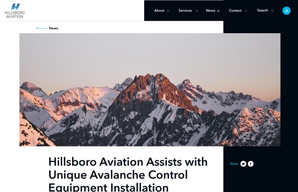
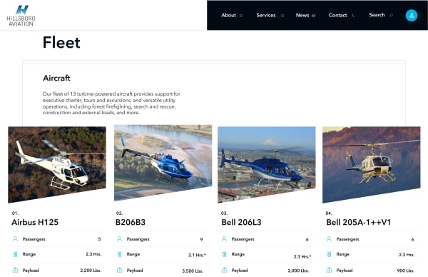
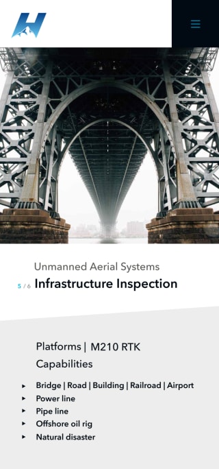
We took a deep dive into all the factions of the company to better understand their struggles, pain-points, in-house needs and the overall user-experience. We came out the other end and delivered big on a promise to streamline the user journey and create a simple navigation experience that would get users to where they needed to be. Refining page layouts and content, creating intuitive navigation patterns, adding simple animations, icons, and unique image containers were all things that added to the overall enthralling experience.
