Oh Planning
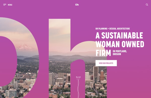
A bold design that reflects the culture at Oh Planning Architecture + Design. Colorful animations and bold typography help breathe new life into a progressive architecture firm.

Agency
- Murmur Creative
Role
- Visual Designer
- Experience Designer
Photography
- Client Provided
Completed
- November, 2019
Oh Planning came to us with the goal of revitalizing their website to better reflect their culture and projects. As the first female-lead architecture firm in the area, it was important that this come through on their site. Along with a heavy leaning towards work in the educational arena, their website needed to highlight their people, their sustainable achievements, and the core culture that makes them unique in their industry.
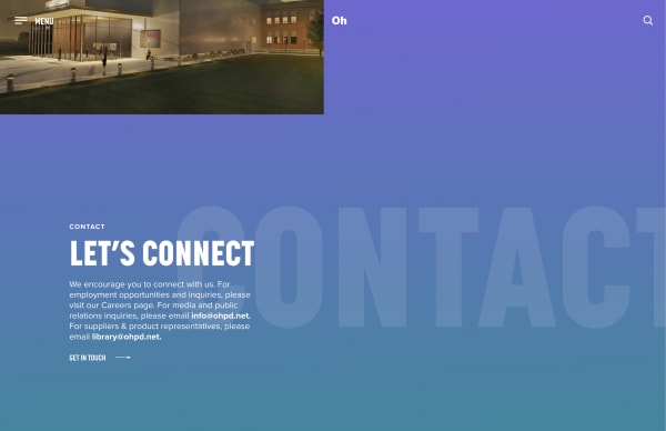
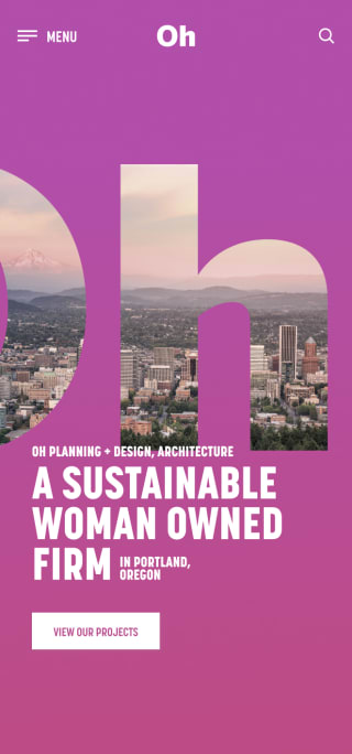
Not afraid to go bold, we set Oh Planning apart by highlighting their woman-owned status with a colorful, feminine gradient that saturates much of the site. Their strong brand statement was put front and center in large in-your-face type that couldn’t be missed. We tied the company to their environment, and community by combining their logo with the city they call home. Animating vines lead the user down the page and highlight their mission of sustainability and progress.
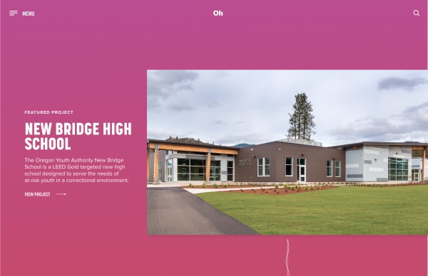
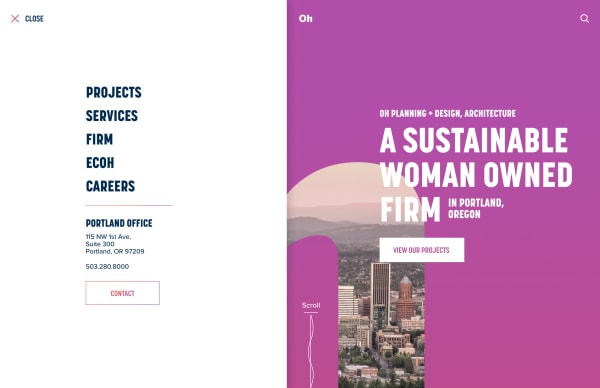
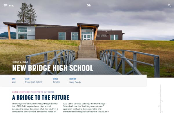
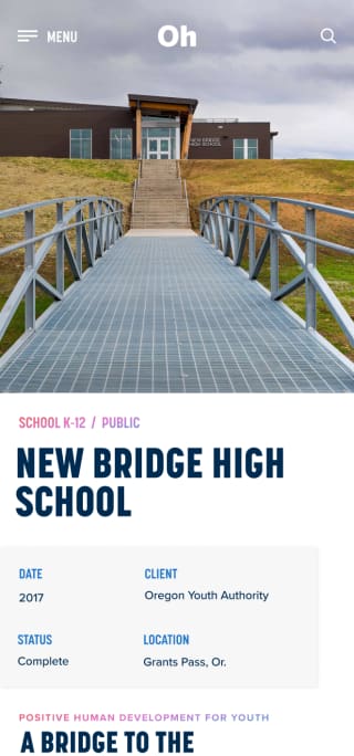
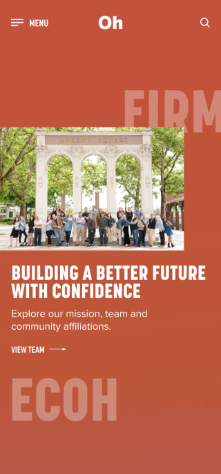
We created organized, fun project pages with large images and colorful typography to highlight the fantastic work they do. A fly-out menu system, micro-interactions, easy to navigate services pages and a fun team page that highlights their culture and their eclectic staff all combine to create a one of a kind website that enhances the culture and brand of Oh Planning.
