Willamette University
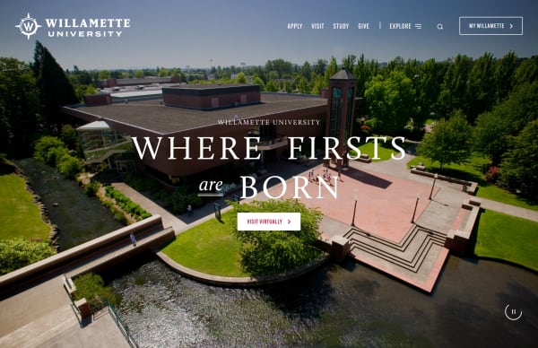
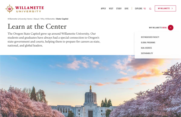
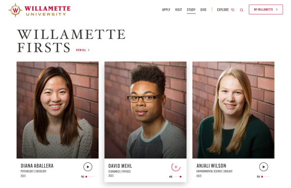
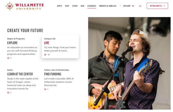
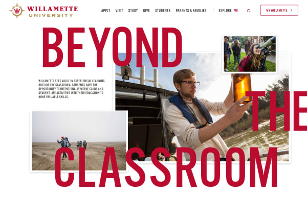
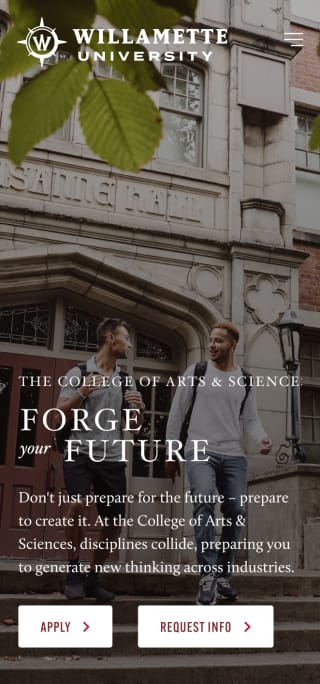
A best in class university website with a deep focus on the user journey and the needs of teachers, prospective students, current students, alumni, and parents.

Agency
- Murmur Creative
Role
- Visual Designer
- UI/UX
Photography
- Nash Co.
- Andrew Bolton
- Tim Acock
Completed
- January 2021
We took on a large scale project for one of the oldest universities in the west, one of vital importance to Willamette University and its community. With the goal of increasing student enrollment we took a deep dive into all aspects of the school to better understand the needs of both faculty and students. Through workshops, interviews, competitive analysis, focus groups, and more, we dove deeply into who they are and what they were becoming. Using all this research we created a best-in-class website for the University.
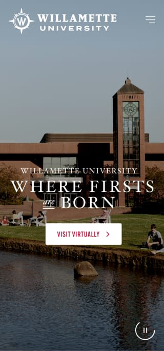
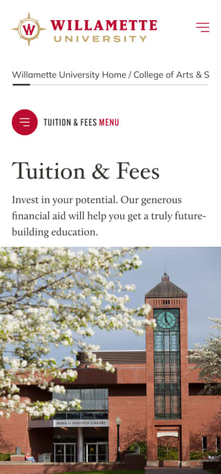
Taking all the data from our analysis, we created a plan for the site that honored the rich history of the university, helped highlight their uniques and what differentiates them from their competitors. We identified key users and created a navigation system that helped route these users to appropriate conversion points. We balanced the needs of departments, faculty, alumni, current, and future students and created a clean experience from start-to-finish for each of these users. We used a dynamic navigation structure, captivating photography and video, impactful page layouts, stats, engaging content, and animations to create an unforgettable experience not often seen in a higher education websites.
